The first impression is the last impression’ – A sentence that closely defines the entire marketing world. A product or service is first perceived based on its image and then later-on its features and benefits are then put into perspective. So, carving out a positive image is an absolute essential.
Out of many factors that contribute to creating an image, fonts play a major role. It can be understood from the fact that when a known brand plans its brand revival or upgrade, they tend to retain the font as well as their base logo. The fast-food giant McDonald is a well-known example of this evolution.
Over the years, their logo has certainly evolved but of course, the font and the colors remain the same. Hence, before you go live, it is important to do it right! That’s why fonts prove to be an essential aspect when defining the tone and theme of your brand. Although one does have a lot of choices in font such as Calibri, Times New Roman, Georgia Bold, and Comic Sans etc. But knowing what compliments the idea of your business is indispensable.
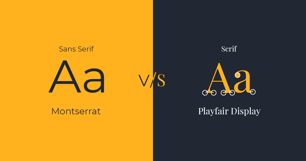
But before the ‘selection day,’ it is important to understand that as a selector what you are supposed to know. So, to make the best choice of font it is important that you understand the different categories. The two most important categories that one needs to understand that is: Serif and Sans Serif.
What:
Thankfully, the difference can be spotted right from the name.
Originating from the word Schreef in Dutch, Serif means a dash and the word Sans, originating from the Latin word sine, means without. Now that we have established the physical difference between the two, let’s understand what each of these signifies.
Why:
While the serif font is a little more ornamental with the serifs extending from the ends, the sans serif font has clean and very precise ends. Both of these have their own unique features that communicate entirely different messages.
Choose Sans Serif When:
You want to come off as youthful and chic. This is the reason why brands that cater to an audience to a young age group generally use san-serif like Helvetica, Open Sans, Proxima Nova, and Arial.
It stands for casual, informal, friendly and very approachable.
Choose Serif When:
You want to come off as traditional and established. One can certainly draw references from the fonts used by The New York Times – a timeless publication that has been around since the 1850s.
Serif fonts focus heavily on embracing tradition and history.
Now that you know what each font has in its kitty for you, you can certainly start picking. Also, if you have some insights about this subject feel free to drop in your message. Our team will be happy to discuss it!